Static Objects
Reading time ~4 minutes
Static controls comprise text labels, rectangle, and image objects. Each static control has its set of parameters, including common scaling properties described above.
The following static controls are available:
-
Text label – a simple text label at a fixed position.
-
Rectangle – framing a rectangle object.
-
Image – a graphic image (e.g., picture, logotype).
All the parameters for static objects are described in detail below.
Text Label
|
The text label object is used for different kinds of text fields at a fixed position. To add this control, press the "Insert Text" button on the controls panel and drag and drop the object to the desired place in the editing area. |
Properties
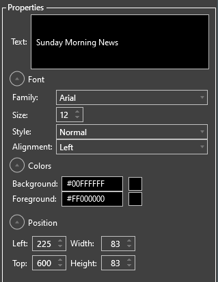
The text label object properties include the text field, font settings, color settings, and position configuration groups.

Click the "Text" field to enter the text to be displayed on your template.
|
Note
|
Use Enter to start a new line. |
In the "Font" configuration group the following settings can be configured:
-
Family – choose the appropriate font family from the corresponding drop-down list.
-
Size – define the font size by pressing the up/down arrow button or entering a desired value via the keyboard.
-
Style – choose the desired font style (bold and/or italic) from the corresponding pull-down menu.
-
Alignment – define the text alignment within the text frame.
In the "Colors" configuration group the following settings can be configured:

-
Background – click this field and choose the desired text label background color either from the standard or available color sets. You can also assign a particular color shade for your text label background in the "Advanced" section.
-
Foreground – click this field and choose the desired text color for your text label in the same way as the background color.
In the "Position" configuration group the following settings can be configured:

-
Left – specifies the left edge of the text area in pixels
-
Top – specifies the top edge of the text area in pixels
-
Width – specifies the width value of the text area in pixels
-
Height – specifies the height value of the text area in pixels
All the performed changes are visible in real-time in the editing area.
Rectangle
|
The rectangle object has two assignments, as a framed colored rectangle of the desired shape (square or not) or as a decorative element such as a grouping frame around objects (when its fill is transparent). |
To add this control, press the "Insert Rectangle" button on the controls panel and drag and drop the object to the desired place in the editing area.
Properties

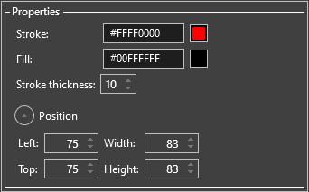
It is possible to configure the following rectangle properties:
-
Stroke – click this field and choose the desired frame color from the color sets available. Select "Transparent" to remove the frame from the rectangle.
-
Fill – click this field and choose the desired rectangle fill color from the color sets available. Select "Transparent" to use the rectangle object as a decorative element.
-
Stroke thickness – define the frame thickness by pressing the or button or entering a desired value via the keyboard.
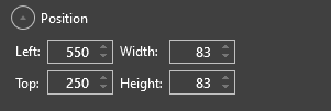
The position of the rectangle in the editing area can be changed by adjusting values in the "Position" configuration group.
-
Left – the left edge of the rectangle in pixels
-
Top – the top edge of the rectangle in pixels
-
Width – the width value of the rectangle in pixels
-
Height – the height value of the text area in pixels
All the performed changes are visible in real-time in the editing area.
Image
|
The image object allows you to add graphics (e.g., picture, logotype) to your layout template. To add this control, press the "Insert Image" button on the controls panel and drag and drop the object to the desired place in the editing area. |
Properties

Press the "…" button to select the image file on your local disk or a network location or enter the path via the keyboard.
|
Note
|
Supported image formats are .jpg, .bmp, and .png preserving background transparency. |
|
Note
|
If you select a file on a network location and run Cinegy Multiviewer as a Windows service, please make sure the service account has permission to access that network file. |
You can specify the stretch mode for the object by selecting one of the following options:
-
None – applies no scaling to the image.
-
Fill – stretches the image to fit in the bounding box entirely without preserving its aspect ratio.
-
Uniform and Uniform to fill – scales the image so that it fits in the bounding box, preserving the original aspect ratio.
Define the image position in the editing area by entering the desired values in the "Position" configuration group:

-
Left – the left edge of the image in pixels
-
Top – the top edge of the image in pixels
-
Width – the width value of the image in pixels
-
Height – the height value of the image in pixels
All the performed changes are visible in real-time in the editing area.


