Interface
Reading time ~8 minutes
The Cinegy Multiviewer Layout Designer tool is used to arrange the display of the Cinegy Multiviewer window and edit its appearance according to your needs.
Cinegy Multiviewer Layout Designer allows the addition of multiple fully customizable layouts to the template that can be configured separately. It has a variety of useful tools arranged in separate groups and is easy to use and manage.
The Cinegy Multiviewer Layout Designer interface comprises 5 main panels:
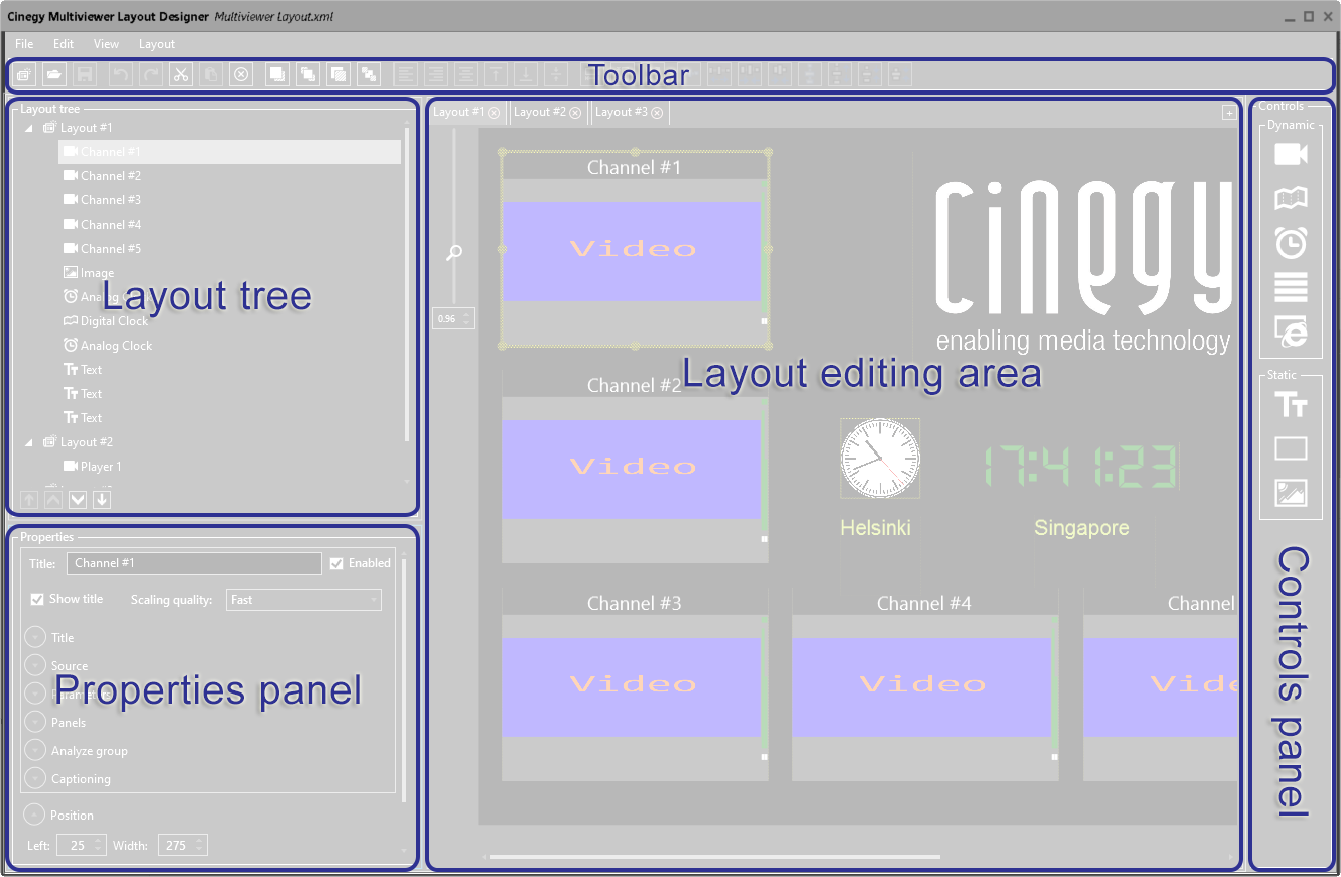
-
Controls panel – the panel that contains buttons representing dynamic and static controls that can be added to the layout.
-
Layout editing area – the Cinegy Multiviewer canvas where editing operations are performed with controls added to it.
-
Layout tree – the tree of controls added to the editing area of the layout template.
-
Properties panel – the panel where the parameters of the selected control are displayed.
-
Toolbar – a set of editing tools for layout controls.
Controls Panel
The controls panel contains buttons representing controls that can be added to the layout. Cinegy Multiviewer Layout Designer offers two groups of controls to use in your layout template: dynamic and static.
Dynamic Controls
| Icon | Object | Description |
|---|---|---|
|
Video channel preview. |
|
|
Digital clock display at a fixed position. |
|
|
Analog clock display at a fixed position. |
|
|
Graphic visualization of CPU activity of the assigned player. |
|
|
Any HTML-based web pages. |


Static Controls
| Icon | Object | Description |
|---|---|---|
|
Simple text label at a fixed position. |
|
|
Framing rectangle object. |
|
|
Graphic image (e.g. picture, logotype). |


To hide available controls, press the down arrow button next to the "Dynamic" and/or "Static" group of controls. To restore the controls display, press the up arrow button next to the corresponding group name.
Layout Editing Area
The editing area represents the layout canvas, where all control editing operations for the current layout are performed.
|
For a closer view of your layout template and the controls on its canvas you can zoom it in using the zoom slider. Zooming in is possible up to x3. To decrease the layout template scaling, drag the scroll bar down using the mouse. It is also possible to scale the layout up / down by clicking the scroll bar and using the "↑" or "↓" keyboard keys correspondingly. |
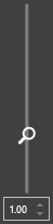
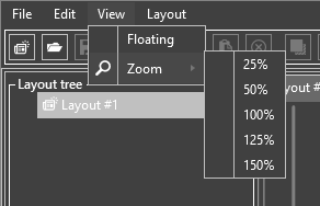
Alternatively, use the "Zoom" command from the "View" main menu to scale the layout by 25% steps:
|
Note
|
If there are several layouts in your template, you can scale each of them separately. |
Layout Tree
In the layout tree the controls added to the editing area of the layout template are shown in order of their addition:
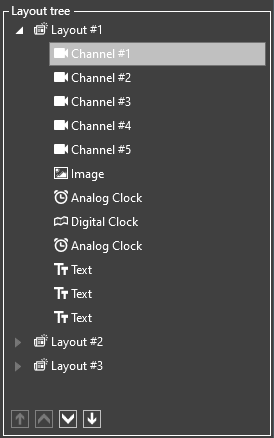
To stack the controls so that one appears in front of another, select the control(s) in the layout tree and use the corresponding arrow button to move up, down, to the top, or to the bottom on the particular layout:

Properties Panel
The properties panel represents a set of parameters available for the currently selected control as well as for the whole layout itself.
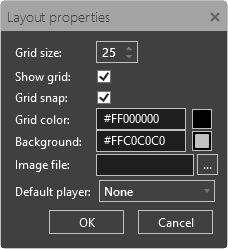
Layout Properties
|
Note
|
The "Properties" dialog can also be launched via the "Properties" command from the "Layout" main menu. |
Cinegy Multiviewer Layout Designer allows you to configure the following layout settings:
-
Grid size – the size of the grid displayed in the editing area. Press the up/down arrow button to enlarge or reduce the layout grid size correspondingly. Alternatively, enter a desired value via the keyboard.
|
Note
|
It is also possible to change the grid size via the "Grid Size" command from the "View" main menu. |
-
Show grid – leave this option selected to have the grid displayed on the canvas or deselect it to hide the layout grid.
-
Grid snap – select this checkbox to align controls on the layout canvas according to the nearest dot in the grid, i.e. snap them to the grid when resizing and/or moving them. Leave the "Grid snap" option deselected to resize and / or move controls on the canvas freely.
|
Note
|
The snapping to grid option works both when the grid is shown and when it is hidden. |
|
Note
|
It is also possible to snap the objects on the layout to the grid via the "Grid Size" command from the "View" main menu. |
-
Grid color – the color of the grid displayed in the editing area. To change the grid color, click the corresponding field and choose the desired color either from the standard or available color sets. You can also assign the layout grid a particular color shade in the "Advanced" section.
-
Background – the color of the layout background. It can be changed in the same way as the grid color.
-
Image file – a graphic image as a layout background. Press the "…" button to choose the desired image as the layout background.
|
Important
|
Refer to Working with Objects for detailed information on controls properties. |
-
Default player – a player added to the current layout, which will be used as the active player at Multiviewer start. All players of the current layout are available in the drop-down list.
Toolbar
The toolbar contains a set of editing tools for the layout controls:

| Button | Action |
|---|---|
|
Press the "New" button to create a new layout template. The keyboard shortcut is Ctrl+N. |
|
Press the "Open" button to open a previously created layout template by selecting the desired one in the common "Open" dialog box. The keyboard shortcut is Ctrl+O. |
|
Press the "Save" button to save all the changes made to the layout template. The keyboard shortcut is Ctrl+S. |
|
Press the "Undo" button to undo one or more (up to 50) actions. The keyboard shortcut is Ctrl+Z. |
|
Select a control in the editing area and press the "Cut" / "Copy" button to cut or copy it respectively. The keyboard shortcuts are Ctrl+X and Ctrl+C. Press the "Paste" button to insert the control to the desired position in the editing area. The keyboard shortcut is Ctrl+V. |
|
To remove a control, select it in the editing area and press the "Delete" button or hit the Delete key on the keyboard. |
|
Select a control in the editing area and press the "Bring Forward" button to bring it one layer up. If several controls are selected, press this button to bring them all one layer up in the editing area correspondingly. |
|
Select a control in the editing area and press the "Bring To Front" button to bring it to the topmost level. If several controls are selected, pressing this button will result in bringing the first selected object to the topmost level; the rest of the selected controls will be brought one layer up correspondingly. |
|
Select a control in the editing area and press the "Send Backward" button to send it one layer down. If several controls are selected, press this button to send them all one layer down in the editing area correspondingly. |
|
Select a control in the editing area and press the "Send To Back" button to send it to the bottommost level. If several controls are selected, pressing this button will result in sending the first selected object to the bottommost level; the rest of the selected controls will be sent one layer down correspondingly. |
|
Select two or more controls and press the "Align Top" button to align them to the level of the first selected control. |
|
Select two or more controls and press the "Align Bottom" button to align them to the level of the first selected control. |
|
Select two or more controls and press the "Align Left" button to left-align them according to the first selected control. |
|
Select two or more controls and press the "Align Right" button to right-align them according to the first selected control. |
|
Select three or more controls and press the "Align Horizontal Center" button to align them according to the center horizontal line of the first selected control. |
|
Select three or more controls and press the "Align Vertical Center" button to align them according to the center vertical line of the first selected control. |
|
The "Make Same Width" function resizes two or more selected controls so that they become of the same width according to the first selected control. |
|
The "Make Same Height" function resizes two or more selected controls so that they become of the same height according to the first selected control. |
|
The "Make Same Size" function resizes two or more selected controls so that they become of the same size according to the first selected control. |
|
Use the "Make Horizontal Spacing Equal" function to make the horizontal spacing between the selected controls equal on the canvas. |
|
Use the "Increase Horizontal Spacing" function to make the horizontal spacing between the selected controls on the canvas larger. |
|
Use the "Decrease Horizontal Spacing" function to make the horizontal spacing between the selected controls on the canvas smaller. |
|
Use the "Remove Horizontal Spacing" function to remove the horizontal spacing between the selected controls on the canvas. |
|
Use the "Make Vertical Spacing Equal" function to make the vertical spacing between the selected controls equal on the canvas. |
|
Use the "Increase Vertical Spacing" function to make the vertical spacing between the selected controls on the canvas smaller. |
|
Use the "Decrease Vertical Spacing" function to make the vertical spacing between the selected controls on the canvas smaller. |
|
Use the "Remove Vertical Spacing" function to remove the vertical spacing between the selected controls on the canvas. |


|
Note
|
The order buttons become enabled when at least one control is selected. The alignment buttons become enabled when two or more controls are selected. The size and spacing changing buttons become enabled when three or more controls are selected. |
|
Note
|
The same commands are accessible from the corresponding main menu drop-down lists as well as from the context menu of the selected object(s). |